We've all experienced this: walking into an older home or a house from the '90s and immediately noticing those bold red walls. However, this traditional approach to incorporating red isn't what we mean when we discuss the "red theory" in modern interior design. That overwhelming red-meets-brown combination feels dated and lacks the sophistication we're aiming for today.
I'll be honest – I had never heard of red theory until interior designer Taylor Simon explained the concept and how to properly incorporate it into spaces. Once I understood the principles, it completely changed how I approach using red in my designs.
So what exactly IS the red theory?
Taylor described it as basically adding anything that's red, big or small, to a room where it doesn't match. It's about strategically placing red elements in spaces where they might seem unexpected or unconventional. It's the strategic use of red in interior design to create energy, warmth, and visual impact through intentional placement rather than overwhelming application.
The psychology behind this approach is important to understand: red is naturally stimulating and energizing. This is precisely why you should avoid using intense reds in bedrooms, where relaxation is the primary goal. Instead, red works most effectively in spaces where you want to encourage activity and conversation – living rooms, kitchens, and home offices where focus and engagement are beneficial.
For those who love red in more intimate spaces, the key is choosing deeper, more sophisticated tones. Rich auburns, deep wines, and moody burgundies provide the warmth and drama of red while maintaining a calming atmosphere suitable for bedrooms or studies.
Red Theory in Practice: Strategic Placement for Maximum Impact
The most successful applications of red theory demonstrate that less truly can be more. Rather than committing to red walls throughout a space, strategic pops of red create focal points that energize a room without overwhelming it.
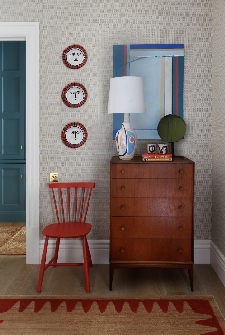
Welcoming Entryway:
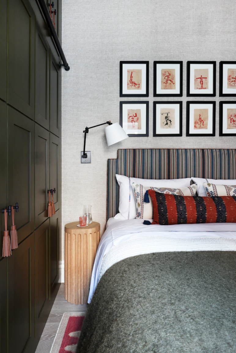
 Bedroom
This entryway showcases red theory perfectly through a single statement chair paired with coordinating wall decor. The red Windsor chair serves as an anchor point, while the matching decorative plates create visual rhythm. The neutral grasscloth wallpaper and warm wood furniture allow the red elements to shine without competition. This approach delivers significant visual impact through minimal application.
Bedroom Application:
 Bedroom
This bedroom demonstrates how to incorporate red in spaces traditionally considered too stimulating for the color. The red appears in carefully curated doses – framed artwork, accent pillows, and a geometric area rug. The deep olive green built-ins provide excellent contrast, making the red accents more prominent. The result is a space that feels both energizing and restful.
Nursery Design Success:
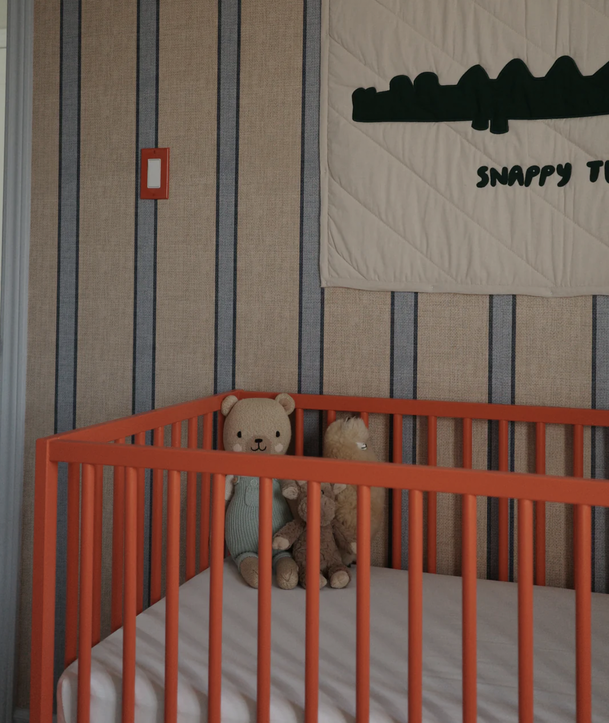 Nursery
This nursery proves that a single red statement piece can transform an entire space. The coral-red crib becomes the room's focal point against neutral striped wallpaper. This approach shows how red theory works across age groups and room functions when applied thoughtfully.

Red Theory Color Palette
The Key Principles of Successful Red Theory:
- Restraint over abundance - Use red as an accent rather than the dominant color
- Quality placement - Choose locations where red will create natural focal points
- Tone consideration - Match the red's intensity to the room's function
- Supporting neutrals - Let neutral backgrounds enhance rather than compete with red elements
The common thread in successful red theory application is strategic restraint. These spaces use red like a design tool – purposefully placed to guide the eye and create visual interest without overwhelming the overall aesthetic. This thoughtful approach proves that effective use of red is about placement and proportion rather than quantity.
Testing Red Theory
Inspired by the red theory explanation, I decided to put red theory to the test using one of my existing SketchUp designs. I had this neutral living and dining space that felt well-designed but perhaps a bit too safe – the perfect candidate for some unexpected red.
The Original Space: The room featured a cohesive neutral palette with sage green furniture, natural wood tones, and warm beige accents. While the space was harmonious, it lacked that spark of energy that draws the eye and creates visual interest.
The Red Theory Transformation: I strategically added red elements throughout the space, and the results speak for themselves:
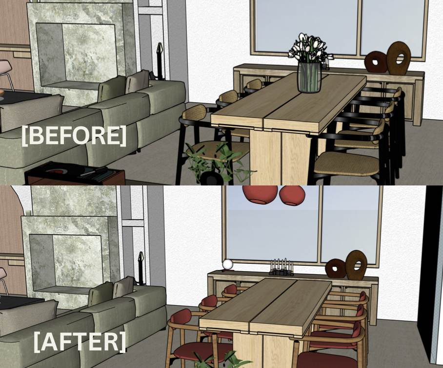
Before & After
- Red accent light above the dining table – an unexpected pop that creates a focal point
- Red dining chair cushions – bringing warmth and energy to the eating area where conversation happens
- Red books and accessories on the shelving unit – small touches that create visual rhythm
- Red decorative objects scattered thoughtfully throughout – proving that even tiny red accents make a significant impact
The Result: The space went from pleasant but predictable to dynamic and engaging. The red elements don't clash with the existing green and neutral palette – instead, they complement it by adding depth and visual interest. This experiment perfectly demonstrates the focal point that red theory working in spaces "where red theory doesn't match."
What I learned is that red theory isn't about overhauling your entire color scheme – it's about strategically placing red elements to energize and elevate what you already have.